The Style A poster to my head exploding horror short, Bursters!
Not only am I a big fan of movies but I’m a big fan of movie posters as well. I worked in the movie theater business for many years and I have boxes of posters to show for it. I’m most proud of my purchased collection of a few classic movie posters such as an original
Star Wars: A New Hope,
Raiders of the Lost Ark,
Evil Dead 2(signed by
Bruce Campbell),
Batman(
Tim Burton version),
Aladdin, etc. I love the marketing side of filmmaking as much as the filmmaking itself and a good poster can do a great deal for making your movie known and remembered.
Since my film
Bursters I’ve made it my mission to make sure my films have a good poster. I’m really tired of seeing people on the independent side of film dropping the ball when it comes to the one sheet. Most of the time they create a hastily assembled montage of heavily photoshopped images. Something a 12 year old could do on their
Macbook.
You have to put as much creativity into your marketing materials as you do your movie, because many times the marketing materials are the first impression about your project. I’m extremely proud of the work that went into the poster for my short horror film,
Bursters(see above.) Brian Eckes and Paul Styron did an awesome job with creating an image that is stylistically both very cool and creepy. There’s a layer of mystery to what the film’s about. You want to know what’s causing the blood in the eye.
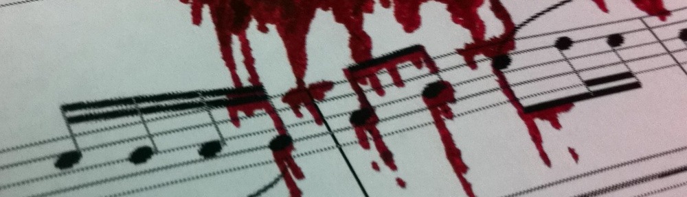
We also did a second Style B poster that showed a female’s eye with a reflection of blood splattering in the eyeball(see below.) I love it!

Bursters Poster Style B
Brian Eckes hit it out of the park again with my most recent short horror film,
Flush with Fear. We went for a more minimalistic approach using black and white for the poster. It’s pretty kick-ass, if you ask me(see below.)

Flush with Fear Poster
Of course, now with preproduction planning happening with my B-movie musical, the poster is big on my mind. This time around I wanted more of a painted image for the marketing angle. Something in the realm of Frank Frazetta. A few months back I contacted an artist I came across while checking out the art exhibit at Dragon*Con. I was totally blown away by his artistry and imagery. I think he’s even done art for some Magic: The Gathering cards. I really wanted him to paint the main image for my B-movie musical poster.
We conversed a few times via email about cost and what he could deliver for what I could offer. The only issue was he was his wife was about to have a baby and he was really busy with other projects, so he wanted me to contact him back in a few months to follow-up. I finally got back with him this week but as luck would have it, he’s not taking on anymore freelance work due to his new addition to the family. Bummer!
This happens all the time in filmmaking. A director has his or her eyes set on a specific outcome whether it be with actor choices, crew choices or poster choices and it doesn’t turn out the way he or she expects. We all make sacrifices. As much as it disappoints me that I couldn’t get this particular artist, I’m still very determined to create an awesome freakin’ poster for this film. I guess I’ll have to comb the art gallery again this year at Dragon*Con for the future artist of my B-movie musical one sheet. I’m up for the challenge.